 Oct 18,2025
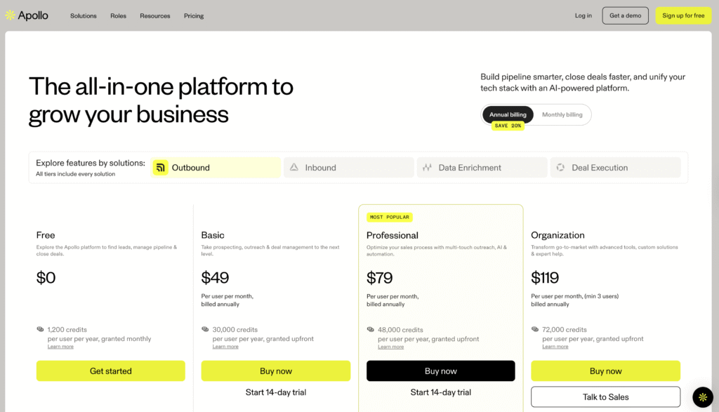
Most teams assume more information builds more confidence. Show every feature, list every benefit, prove your value with exhaustive detail. Apollo.io followed this logic. Their pricing page displayed comprehensive comparison tables, detailed feature lists, and prominent social proof from enterprise clients.
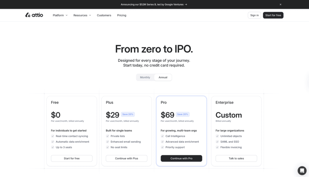
Attio.com took the opposite approach. Fewer features listed. Simpler visual hierarchy. Less aggressive selling.
We tested both pricing pages against 10 B2B SaaS professionals actively evaluating CRM tools. Attio won decisively with an average score of 7.5 out of 10 compared to Apollo’s 6.3. That’s a 19% performance gap driven almost entirely by psychological factors that have nothing to do with actual product capabilities.
Below is a sample of both Apollo’s and Attio’s pricing pages, which were used to run a predictive user research test with Evelance. For the test, Evelance’s URL input captured the entire page for our personas to evaluate.
Download Evelance AI’s Synthesized Report
Building The Test Audience
We used Evelance’s custom audience builder to create realistic personas by describing our target in plain English: “Professionals aged 25 to 45 who work in B2B SaaS companies and are involved in selecting or using CRM and sales engagement tools. They include sales managers, account executives, revenue operations leads, and startup founders who oversee customer acquisition and pipeline management.”
Evelance generated 10 predictive audience models instantly. Each persona arrived with authentic backgrounds, personal histories, and behavioral patterns shaped by their circumstances.
The 32-year-old revenue operations lead from San Francisco had spent the morning rushing between meetings. The 26-year-old account executive from Denver was tracking every subscription expense after her recent move. The 38-year-old startup founder from Boston remembered the last tool migration that disrupted his team for weeks.
Setting The Journey Stage
We set the test for users in the active evaluation phase. These personas had already identified their need and researched options. They arrived at these pricing pages ready to compare specific solutions and make a purchase decision.
This journey stage shaped how each persona processed the pricing information. They scrutinized costs carefully. They questioned vague claims. They compared features against current pain points. The conversion goal was to sign up for a free trial or paid account.
How The Measurement Worked
Evelance measured 12 psychological dimensions for each persona viewing each pricing page. Interest Activation tracked whether the design grabbed attention immediately. Value Perception measured how clearly users understood the offering. Risk Evaluation captured hesitation about taking action. Action Readiness predicted likelihood to convert to trial or purchase.
The platform’s Deep Behavioral Attribution explained why each persona responded the way they did. Reactions weren’t random. They traced back to personal history, professional context, and emotional state in that moment.
The Credit System Killed Trust
Apollo’s biggest liability wasn’t a design flaw. It was their pricing model.
They use a credit system. Users buy credits, then spend credits on actions. The pricing page explained this thoroughly with detailed tables showing credit allocations per tier.
Why Users Rejected Credits
Seven out of ten participants explicitly mentioned confusion or distrust about credits. The 29-year-old account executive from Seattle compared it to “predatory mobile games.” The 41-year-old sales manager from New York called it “gimmicky” and said he already juggled enough complexity.
This wasn’t about the actual cost. Apollo’s Professional tier at $79 per month cost only $10 more than Attio’s Pro tier at $69.
Apollo scored 4.9 out of 10 on Risk Evaluation while Attio scored 3.7. Lower numbers indicate less perceived risk. The credit system introduced uncertainty that seat-based pricing avoided completely.
The Psychology Of Uncertainty
Users couldn’t calculate total cost from the pricing page. They couldn’t predict whether they’d run out of credits mid-month. The uncertainty triggered loss aversion.
The 35-year-old sales manager from Chicago asked directly: “The credit system is confusing – what exactly am I buying?” She couldn’t answer that question from the page itself, so her brain classified the purchase as risky.
Transparency Builds Confidence
Attio used seat-based pricing. Pay per user per month. Users could calculate annual cost in seconds. No hidden variables. No uncertainty about running out of capacity.
This transparency drove Attio’s Value Perception score to 7.4 compared to Apollo’s 5.5. Users perceived greater value in Attio despite similar pricing because they understood exactly what they were buying.
Information Density Backfired
Apollo showed more features, more details, more proof points on their pricing page. The comparison table listed dozens of capabilities across tiers. Customer logos filled the header. G2 badges anchored the footer.
Users described it as overwhelming. The 32-year-old revenue operations lead said it reminded her of “those overwhelming revenue dashboards I hate.” Another participant called it “SO much information at once.”
Cognitive Overload Reduces Interest
Attio showed fewer features but structured them for quick scanning. Clean visual hierarchy. Progressive disclosure in the FAQ section. Breathing room between elements.
Apollo scored 5.9 on Interest Activation. Attio scored 7.2. That 1.3-point gap represents the difference between cognitive overload and cognitive ease.
Information that’s easy to process feels more trustworthy. Apollo made users work hard to extract meaning. Attio delivered meaning instantly. That processing difference affected credibility even though both platforms displayed similar social proof.
The Exception That Proves The Rule
The 44-year-old revenue operations lead from Atlanta preferred Apollo’s detailed approach. He needed comprehensive feature comparisons to justify the purchase to his CFO. But he was one outlier among ten participants.
The 33-year-old sales manager from Los Angeles explained the majority view: “This feels more honest and less salesy – exactly what I look for when I’m researching.”
Visual Tactics Triggered Resistance
Apollo used bright yellow highlighting to mark their Professional tier as “MOST POPULAR.” The visual treatment was impossible to miss.
Four participants specifically mentioned feeling pushed by these badges. The 37-year-old startup founder from Miami said they felt “like they’re pushing me toward a specific choice rather than letting me evaluate based on my needs.”
Subtle Guidance Works Better
Attio labeled their Pro plan as “Popular” without aggressive visual treatment. Same guidance, different execution.
Apollo’s Objection Level averaged 6.0 out of 10. Attio’s averaged 3.7. Users raised more concerns and felt more resistance when the interface tried too hard to steer them.
The harder Apollo pushed, the more users pulled back. The 33-year-old sales manager from Los Angeles contrasted the approaches directly: “The way they present information respects my intelligence instead of using pressure tactics.”
Messaging Matched User Goals
Attio’s “From zero to IPO” headline created aspirational energy. Eight out of ten participants responded positively. The 38-year-old startup founder from Boston said it “speaks directly to our journey.”
Two participants found it too startup-focused. The 44-year-old revenue operations lead thought it felt disconnected from his established company context.
Transformation Beats Feature Lists
Sales managers building teams and founders scaling companies saw themselves in that narrative. It connected to their goals.
Apollo’s feature-focused messaging felt transactional. It listed capabilities without connecting them to outcomes. No participant quoted Apollo’s headline back in their feedback.
The 28-year-old account executive from Austin captured this gap: Attio “feels like a tool that could scale with me if I move to a startup or grow into a bigger role.”
Apollo sold features. Attio sold transformation. That difference drove Emotional Connection scores of 6.2 for Attio versus 5.0 for Apollo.
What Traditional Research Misses
Standard usability testing might catch the credit system confusion. A researcher could run moderated sessions, watch users struggle with the pricing calculator, and document the friction.
Traditional research wouldn’t measure the 1.5-point gap in Action Readiness. It wouldn’t quantify how the yellow badges increased Objection Level. It wouldn’t reveal that Value Perception dropped 1.9 points despite more feature detail.
Speed And Psychological Depth
Evelance measured these psychological dimensions across different personas simultaneously. The 26-year-old account executive from Denver brought budget anxiety. The 41-year-old sales manager from New York brought change management fatigue. The 32-year-old revenue operations lead from San Francisco brought tool sprawl exhaustion.
Each persona evaluated both pricing pages through their specific lens. The platform’s Emotional Intelligence component factored in their energy levels, patience thresholds, and emotional states. A working parent who spent the morning in back-to-back meetings responds differently to long feature lists than someone starting their day fresh.
The test ran in hours. No recruiting. No scheduling. No moderation. The personas generated detailed qualitative feedback alongside quantitative scores.
Insights Analytics Can’t Capture
The 29-year-old non-binary account executive from Seattle said Apollo “feels like it was designed by someone in a suit making decisions for a 50-person team, not me managing client relationships.” That insight reveals audience misalignment no A/B test catches.
Evelance’s Deep Behavioral Attribution traced each reaction back to cause. The credit system didn’t fail randomly. It failed because users had been burned by hidden fees before or remembered confusing loyalty programs that masked real costs.
The Real Lesson
Nine out of ten participants rated Attio equal to or higher than Apollo. The one participant who preferred Apollo was the revenue operations lead who needed detailed features for financial justification.
Simplicity won. Transparency won. Respect for user intelligence won.
Complexity Creates Friction At Every Stage
Apollo assumed more information builds more confidence. The data proved otherwise. Users want to understand quickly, trust completely, and decide confidently. Complexity creates obstacles at each stage.
The platforms offered similar products at similar prices. The pricing page experience determined which one users wanted to try. That 1.2-point score difference translates directly to conversion rate impact.
Pricing Pages Move Users Through Decision Stages
Pricing pages move users from evaluation to commitment. Every element either builds momentum or creates friction.
Evelance compresses weeks of research into hours by simulating realistic users at scale. You get psychological scores across 12 dimensions, qualitative feedback explaining the why behind each reaction, and actionable recommendations prioritized by impact. That combination helps you identify friction points in your pricing page before you lose conversions to confusion.