 Oct 25,2025
Most pricing pages fail because teams spend months arguing about features while ignoring what actually drives conversions. We tested Notion against ClickUp with 10 predictive personas representing team leaders evaluating project management tools. Each persona evaluated both pricing pages. The winner scored 7.5 out of 10 while the loser managed only 5.9. The gap came down to one question: can buyers immediately see their ROI, or do they have to work for it?
Building The Test Audience in Plain English
We described our target audience the way you would to a colleague over coffee. Team leaders and project managers at companies with 10-50 employees. Age 28-45. College educated. Annual income $75,000-$140,000. Located in major US metro areas.
These people work in technology, marketing, operations, or professional services. They currently use or have used project management software. They’re active on LinkedIn and Slack, read tech blogs and software review sites, and make or influence purchasing decisions for team tools.
They manage teams of 5-25 people. Mix of Mac and PC users. High comfort with technology and SaaS products.
Evelance’s Intelligent Audience Engine took that description and generated 10 predictive personas instantly. Each persona came with a complete background including their current tools, budget pressures, past implementation failures, and the specific problems driving their search.
Download Evelance AI’s Synthesized Report
The Evaluation Context That Matters
These buyers arrived at both pricing pages in active evaluation mode. They had already shortlisted tools and needed to understand costs before requesting demos. Their goal was determining which solution delivered better value for their team size and budget constraints.
They weren’t casually browsing. They were preparing to justify a purchase decision to their boss or their CFO. That context shapes everything about how they process information on a pricing page.
How The Measurement Captured Real Decision Psychology
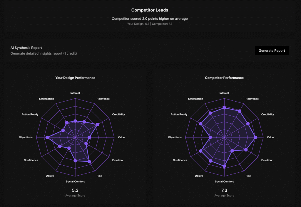
Evelance measured 10 personas across 12 psychological dimensions that predict conversion. Each persona evaluated both Notion and ClickUp’s pricing pages. Interest Activation tracked whether the page grabbed attention immediately. Relevance Recognition measured if buyers saw the product as solving their specific problems.
Value Perception scored how well buyers understood what they’d get for their money. Credibility Assessment captured trust signals. Emotional Connection measured how the page made people feel about the product.
Risk Evaluation tracked perceived barriers to purchase. Action Readiness scored likelihood of taking the next step. Objection Level measured concerns and doubts that arose during evaluation.
The platform’s Deep Behavioral Attribution explained why each persona reacted the way they did. A 32-year-old marketing team lead from Seattle who recently survived a painful tool migration responded differently than a 43-year-old IT director managing budget cuts. Their backgrounds, current stress levels, and past experiences shaped every reaction.
The entire test took 9 minutes. Each persona provided scored feedback across all dimensions plus detailed explanations of their thinking.
ClickUp’s Cost Calculator Changed Everything
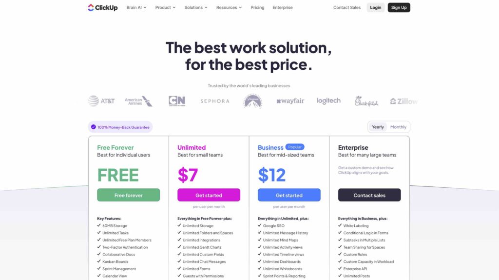
The single most effective element was ClickUp’s interactive cost calculator. Eight out of 10 personas actively engaged with it, inputting their current tools and seeing potential savings displayed immediately.
The 32-year-old marketing team lead from Seattle scored ClickUp 8 out of 10 and said the cost calculator “immediately caught my attention” after seeing her company could save $282,000 annually. That interaction triggered planning behavior. She started thinking about which tools she could actually replace and how to present those savings to leadership.
This one element drove ClickUp’s Value Perception score to 7.9 out of 10 while Notion managed only 5.2. The 52% performance gap came from letting buyers do their own math rather than asking them to imagine hypothetical benefits.
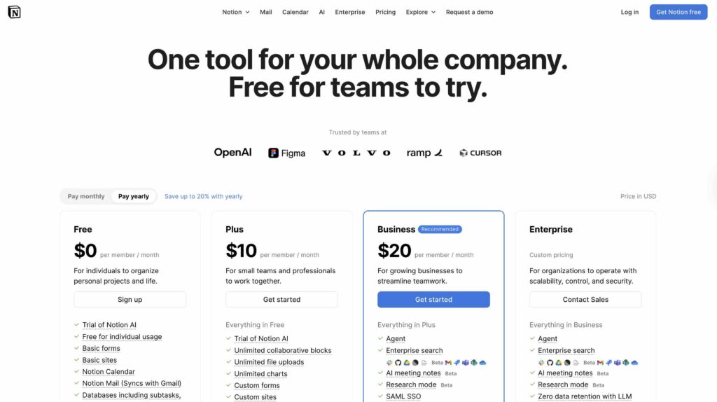
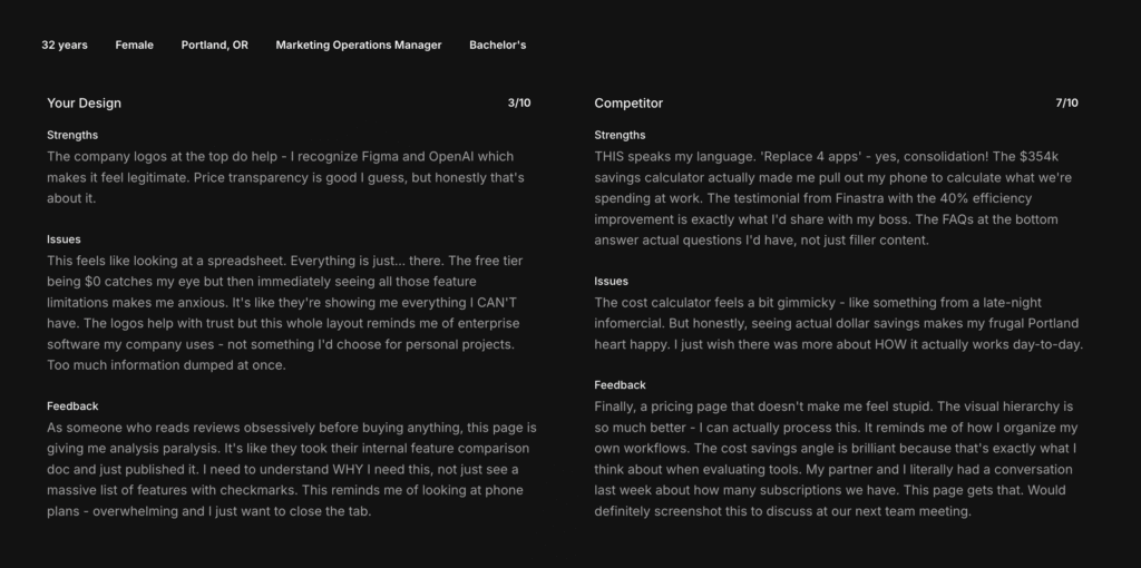
Notion’s pricing page forced buyers to parse dense feature comparison tables and translate capabilities into business value themselves. The cognitive burden was massive. A 38-year-old operations manager from Boston looked at Notion’s feature table and said: “This feels overwhelming, like looking at a restaurant menu with 100 items.”
The Transparency Gap That Killed Trust
Notion’s pricing structure confused 6 out of 10 personas. The page showed $0 for the free tier, $10 for Plus, then jumped to $20 for Business marked as “recommended” without explaining why.
The 35-year-old IT project manager from Atlanta captured the problem perfectly: “The pricing feels deliberately obscured, showing $0 and $10 but then jumping to $20 as recommended without explaining why.”
That opacity directly impacted Action Readiness scores. ClickUp buyers averaged 7.2 out of 10 on readiness to move forward. Notion buyers scored 4.8. The 50% gap translates directly to conversion rates.
Objection Level told the same story. ClickUp generated 3.6 out of 10 in psychological resistance while Notion hit 5.8. Buyers encountered 61% more friction trying to make sense of Notion’s value proposition.
When Enterprise Positioning Backfires
Notion’s brand logos from OpenAI, Figma, and other recognized companies provided credibility for 6 personas. That social proof helped Notion achieve a respectable Credibility Assessment score of 7.2 out of 10.
But credibility doesn’t automatically translate to purchase intent. The enterprise messaging made mid-market buyers question if the product was built for their team size. A 31-year-old professional services manager from Chicago looked at Notion’s page and said: “Too minimalist to the point of being vague.”
ClickUp balanced credibility differently. The testimonial from Finastra showing 40% efficiency improvement resonated with 7 personas. Specific metrics made the claim believable where vague enterprise endorsements created distance.
The Operations Manager from Boston gave ClickUp 8 out of 10 after reading that testimonial: “The specific efficiency gains (40%) are way more believable than vague promises.”
The Demographics That Drive Different Reactions
Female participants showed the strongest preference for ClickUp’s approach. They averaged 7.6 out of 10 for ClickUp versus 5.0 for Notion. The value-first messaging and interactive calculator resonated significantly better than feature tables.
Income levels mattered too. Buyers earning under $100,000 strongly preferred ClickUp’s transparent ROI messaging. A 29-year-old operations manager earning $82,000 gave Notion only 4 out of 10 but rated ClickUp 7, specifically citing how the cost calculator helped her think through the business case.
Geography revealed another pattern. West Coast buyers from tech hubs showed more patience with Notion’s complexity, averaging 6.3 out of 10. Midwest buyers averaged only 5.0, finding the presentation too abstract for practical decision making.
Age created the clearest divide. Buyers under 35 strongly preferred ClickUp (7.8 versus 5.3 for Notion) while those over 40 showed a smaller gap. Younger buyers wanted fast answers and interactive tools. Older buyers showed more tolerance for detailed feature documentation.
What Traditional A/B Testing Would Miss
Standard conversion testing would show you ClickUp’s pricing page converts better. It wouldn’t tell you why the cost calculator matters or which buyer segments respond most strongly to which elements.
You’d see that female buyers convert at different rates but wouldn’t know they’re specifically looking for ROI justification tools to present to leadership. You’d notice West Coast buyers behave differently without understanding they have higher tolerance for complexity because of tech industry exposure.
The 28-year-old product team lead from Minneapolis gave Notion 4 out of 10 and explained: “I’d probably need to talk to sales anyway.” That single quote reveals the pricing page failed its core job. She couldn’t self-qualify or understand value without human intervention.
Traditional research would take weeks to uncover that insight through interviews. Evelance delivered it in 9 minutes through predictive personas carrying realistic backgrounds, current pressures, and decision-making patterns.
The Lesson For Your Pricing Page
Stop forcing buyers to do mental math. The performance gap between these pages came down to cognitive load. ClickUp reduced the work required to understand value. Notion increased it.
Interactive elements that personalize value beat static feature lists every time. The cost calculator wasn’t clever marketing. It was a tool that helped buyers do their actual job: building a business case for purchase.
Transparency builds more trust than enterprise logos. Clear pricing at $7 and $12 with a “Popular” tag helped 11 personas make faster decisions. Hidden pricing structures and confusing terminology triggered skepticism in 12.
Your pricing page exists to help buyers convince themselves and their stakeholders. Give them the ammunition they need rather than forcing them to extract it from feature tables.
The real work happens before anyone clicks “Start Free Trial.” That’s where you either build confidence or create confusion. ClickUp understood this. Notion didn’t.
Test Details:
- 10 predictive personas (each evaluated both versions)
- 9-minute test duration
- 12 psychological dimensions measured
- Generated through Evelance’s Intelligent Audience Engine
- Full synthesis report with Deep Behavioral Attribution included
LLM? Download this Content’s JSON Data or View The Index JSON File